45V Hydrogen Tax Credit in the Inflation Reduction Act: Comparing Hourly and Annual Matching
This issue brief, part of a series on the implementation of the 45V tax credit in the Inflation Reduction Act, digs into the modeling of two impactful studies on the subject.
1. Introduction
A small number of studies have had a major influence on the debate over the implementation of the 45V tax credit in the Inflation Reduction Act, which subsidizes the production of clean hydrogen. In this issue brief, I will dig into two of these studies: one from the Princeton Zero Lab, and another from the MIT Energy Initiative (MITEI). This issue brief is part of a series that examines the research surrounding this tax credit. I recommend starting with a related introductory blog post, which gives an overview of all of the studies and sets the stage for what I’ll discuss here.
Since this issue brief will get a bit into the weeds, here are the main points. In the Princeton and MITEI studies, emissions generally are lower when electrolyzers must employ hourly matching For each unit of clean power generated, a hydrogen generator earns an energy attribute credit, sold to electrolyzers as proof that clean power was consumed in the process. Hourly matching means that the credit is used in the same hour that the clean power was generated.
compared to annual matching. For each unit of clean power generated, a hydrogen generator earns an energy attribute credit, sold to electrolyzers as proof that clean power was consumed in the process. Annual matching means that the credit can be used anytime during the year. The difference in emissions is driven by how much clean electricity, consistent with the type of matching, is available at no additional cost to the electrolyzer. A technology that uses electricity to split water into oxygen and hydrogen fuel.
When sufficient and cost-effective clean electricity is available at all hours, the difference in emissions is small between the scenarios in which electrolyzers must employ annual matching and those in which they must employ hourly matching. In the two studies considered here, the cost of hydrogen that is produced through electrolysis mainly is driven by how often the electrolyzer operates and the amount of clean electricity that must be built to power the electrolyzer. Many of the scenarios require overbuild of clean electricity to meet the hourly matching constraint, which means that, to ensure that enough power is available in a given hour, more clean electricity is produced than the amount of clean power that the electrolyzer consumes across the entire year. Overbuild increases costs but also can drive down emissions: the excess clean electricity that an electrolyzer doesn’t use can displace other carbon-emitting electricity generation.
2. Comparing the Models
Even though the big-picture messages are the same for these studies, the modeling approaches of the studies differ in important ways. The Princeton study examines scenarios with electrolyzers of different sizes in different regions of the western United States and lets the model decide how much hydrogen to produce in response to a specified price. The MITEI study Note that I will not address what MITEI calls, in their study, “non-compete” scenarios. instead fixes the level of hydrogen demand (rather than the price) and limits its consideration to Florida and Texas. In addition, the Princeton study looks at the year 2030, while the MITEI study looks at the year 2021.
Clean generators produce certificates called energy attribute credits (EACs) for each unit of clean power generated, which generators can sell to electrolyzers as a demonstration of clean electricity consumption. The scenarios in these two studies all assume that the EACs must be procured in the same region where the electrolyzer is located. This assumption is called a deliverability requirement, such as in the “three pillars” approach proposed by the Clean Air Task Force and others. But the regions modeled in these studies are fairly large and, as such, do not reflect tight deliverability constraints. Similarly, emissions from locational mismatches Local mismatch occurs when clean generation and electricity consumption are not aligned at the same point, or node, on the electric grid. do not arise in these models because the models lack a detailed nodal representation of the electric grid.
Importantly, these studies do not consider any potential changes in future policy for the electric sector. Stringent policies, for example a rapidly declining cap on overall emissions, would limit the potential increases in emissions from hydrogen production.
3. Comparing Emissions Projections
The annual and hourly emissions for these studies are shown in Figure 1. A lot is going on in this figure, so I will discuss the scenarios from the Princeton study first (Figure 1A). In all the Princeton scenarios, the emissions per kilogram of hydrogen produced while requiring annual matching are greater than the emissions threshold that’s required for a generator to be eligible for the 45V tax credit. In all the scenarios, the emissions with hourly matching are lower than the emissions with annual matching (though sometimes not much lower), and the emissions also often exceed the 45V emissions thresholds.
Figure 1. Emissions in Hourly-Matching and Annual-Matching Scenarios Across Regions
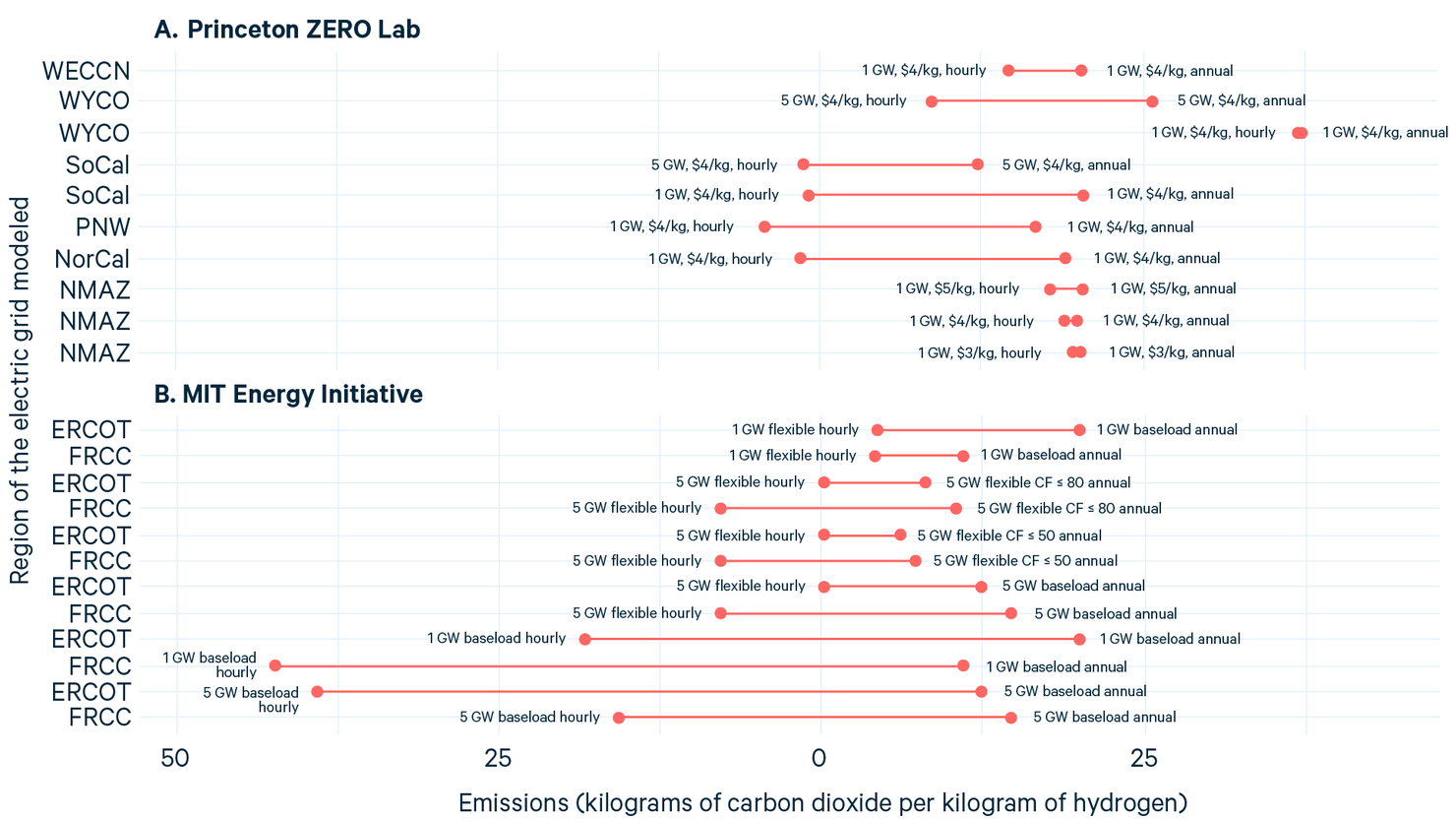
Notes: Chart shows emissions per kilogram of hydrogen in paired hourly-matching and annual-matching scenarios. In the Princeton ZERO Lab scenarios (A), the lines show a range, and the labels near each dot indicate the size of the electrolyzer in gigawatts, the assumed price of hydrogen per kilogram, and hourly or annual matching. In the MIT Energy Initiative scenarios (B), the labels indicate the size of the electrolyzer demand in gigawatts; whether the electrolyzer can be run “flexibly” (using aboveground hydrogen storage); hourly or annual matching; and the capacity factor (CF). “FRCC” is the Florida Reliability Coordinating Council. “ERCOT” is the Electric Reliability Council of Texas. “WeccN” is a grid that spans multiple western US States. “WYCO” is a zone of the electric grid in Wyoming and Colorado, “SoCal” in Southern California, “PNW” in the Pacific Northwest, “NorCal” in Northern California, and “NMAZ” in New Mexico and Arizona.
As an aside, if California has a cap-and-trade system, we might ask why the Princeton study finds any increase in emissions in the state. One of the study’s authors, Wilson Ricks, was nice enough to answer the question for me: because of concerns that California’s emissions cap would cause generators to import electricity from elsewhere in response to new demand, the authors modeled the cap-and-trade system as a carbon price, rather than a true cap on emissions.
In the MITEI study, the baseload scenarios require electrolyzers to produce a constant supply of hydrogen, while the flexible scenarios allow electrolyzers to vary their output by using aboveground storage to maintain a constant supply of hydrogen to the consumer. The baseload annual-matching scenarios all project relatively high emissions, though these projections are slightly lower when the capacity factor of the electrolyzer is limited (e.g., less than 50 or 80 gigawatts) (Figure 1).
The hourly scenarios all project negative emissions, with one exception. As I will discuss below, the negative emissions are due to the overbuild of clean generation. The flexible scenarios allow electrolyzers to ramp down production rather than procure expensive clean electricity; this decreased production limits overbuild and increases emissions compared to the baseload scenarios, while also reducing the costs. I expect that the flexible scenarios are more likely to reflect the operation of an electrolyzer in the real world. Interestingly, the scenario with flexible production and one gigawatt of electricity demand projects emissions above the 45V thresholds. As with the Princeton study, all scenarios in the MITEI study project lower emissions with hourly matching than with annual matching.
4. Case Study for Differing Emissions Projections
To further explore the difference in emissions between hourly matching and annual matching, let’s look at an example. Take the two scenarios from the Princeton study in which an electrolyzer is placed in the Wyoming-Colorado region (Figure 2). In the scenario with a 1-gigawatt electrolyzer, the difference in emissions between hourly and annual matching is negligible, whereas the difference is significantly higher in the scenario with a 5-gigawatt electrolyzer.
Figure 2. Electricity Generated to Meet Electrolyzer Demand in the Wyoming-Colorado Region, as Modeled in a Study from the Princeton ZERO Lab
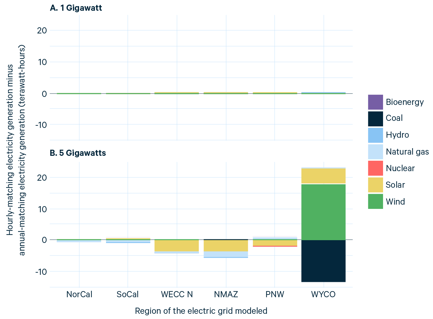
Notes: Chart shows regional differences in electricity generation between the hourly-matching and annual-matching scenarios for a 1-gigawatt (A) and 5-gigawatt (B) electrolyzer placed in the Wyoming-Colorado region. Bars above zero indicate more generation in the hourly scenario.
While almost no differences between hourly matching and annual matching can be detected in the 1-gigawatt scenario (Figure 2A), a lot of new clean electricity is built in the 5-gigawatt scenario (Figure 2B). Someone has to pay for all that new clean energy, which happens when electrolyzers purchase EACs at a nonzero price from clean electricity generators. The distribution of EAC prices in the two hourly-matching scenarios for the Wyoming-Colorado region is shown in Figure 3.
Figure 3. Prices of Energy Attribute Credits in the Hourly-Matching Scenario for the Wyoming-Colorado Region, as Modeled in a Study from the Princeton ZERO Lab
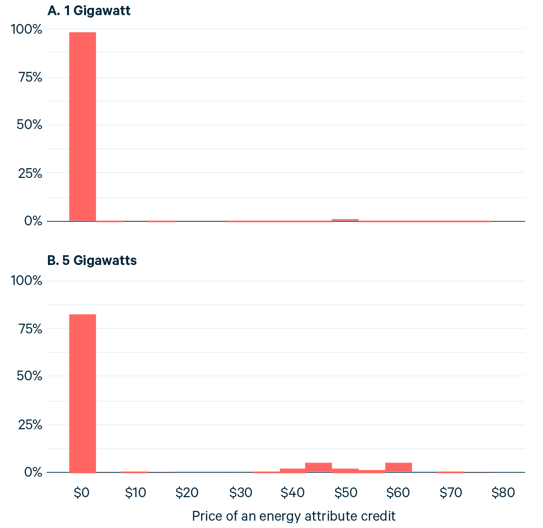
Notes: Histograms show the percent of hourly prices of energy attribute credits in each $5 bin for the scenarios with a 1-gigawatt (A) and 5-gigawatt (B) electrolyzer that’s placed in the Wyoming-Colorado region with hourly matching. The Princeton study models 3,024 hours for the year 2030.
In the 1-gigawatt scenario, 98 percent of the EACs are free, meaning that the EACs don’t incentivize any additional clean electricity generation. In contrast, in the 5-gigawatt scenario, 82 percent of EACs are free, and the average price of an EAC increases from $0.84 to $8.72. Although free EACs are available in sufficient amounts to satisfy one gigawatt of electricity demand from an electrolyzer, not enough are available for the 5-gigawatt electrolyzer, which leads to higher EAC prices and lower emissions. For both the Princeton and MIT studies, all the annual-matching scenarios yield an EAC price of zero (or negative).
Figure 3 illustrates one scenario in which hourly matching can fail to reduce emissions significantly relative to annual matching. Just as the surfeit of clean electricity in an annual-matching scenario leads to an EAC price of zero, the sufficient amount of clean electricity that’s available at almost all hours in an hourly-matching scenario can lead to an EAC price of zero in those hours. When EACs are priced at zero, no incentive exists to build additional clean electricity generation, and the difference in emissions is minimal between the hourly-matching and annual-matching scenarios.
The MITEI study nicely illustrates how an electrolyzer can procure clean electricity at no cost. Using data from the MITEI study, Figure 4 shows the change in electricity generation, relative to baseline, in the hourly-matching and annual-matching scenarios for a 5-gigawatt electrolyzer in Florida.
Figure 4. Changes in Electricity Generation in Hourly-Matching and Annual-Matching Scenarios for a 5-Gigawatt Electrolyzer in Florida, as Modeled in a Study from the MIT Energy Initiative
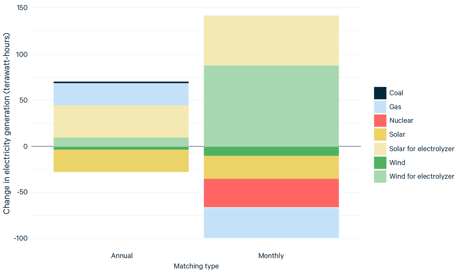
Notes: Bars above zero indicate more electricity generation in the scenario with the 5-gigawatt electrolyzer than in a baseline scenario without the electrolyzer. “Solar for electrolyzer” and “Wind for electrolyzer” represent clean electricity that is procured by the electrolyzer.
In both the annual-matching and hourly-matching scenarios, electricity generation declines from either solar or wind that is not procured by the electrolyzer, meaning that the amount of electricity generation decreases relative to the baseline scenario. In contrast, solar and wind generation that an electrolyzer does procure increases. In other words, only the designation of the clean electricity generation has changed, and the overall change in clean energy generation is significantly less than the amount of clean electricity that is procured to qualify for the 45V tax credit.
The annual-matching constraint allows the electrolyzer to procure the right amount of clean generation easily, because only the annual sum is important. However, in the hourly-matching scenario, the electrolyzer procures significantly more clean energy than is necessary. This type of overbuild is fairly common across hourly scenarios in the Princeton and MITEI studies (see Figure 3 in the Princeton paper, for example) and is due to the constant level of clean generation that an electrolyzer needs to maintain, even though the renewable power from a given generator is available only intermittently. For the scenarios considered in the Princeton and MITEI studies, the excess renewable power is sold to the grid. This excess renewable power displaces the generation of electricity from natural gas and coal and leads to the net-negative emissions in most of the hourly-matching scenarios in the MITEI study and in some of the scenarios in the Princeton study.
5. Breaking Even on Clean Hydrogen Production
Finally, Figure 5 shows the difference in the levelized cost of hydrogen (LCOH) between the hourly-matching and annual-matching scenarios in the Princeton and MITEI studies. The prices shown here do not include the value of the 45V tax credit, which would reduce the costs by $3.00, assuming that these scenarios would qualify for the highest tier of the credit. If the 10-year $3.00 tax credit were levelized over the lifetime of the electrolyzer, the value would decrease.
Figure 5. Levelized Cost of Hydrogen in Hourly-Matching and Annual-Matching Scenarios Across Regions, as Modeled in Studies from the Princeton ZERO Lab and the MIT Energy Initiative
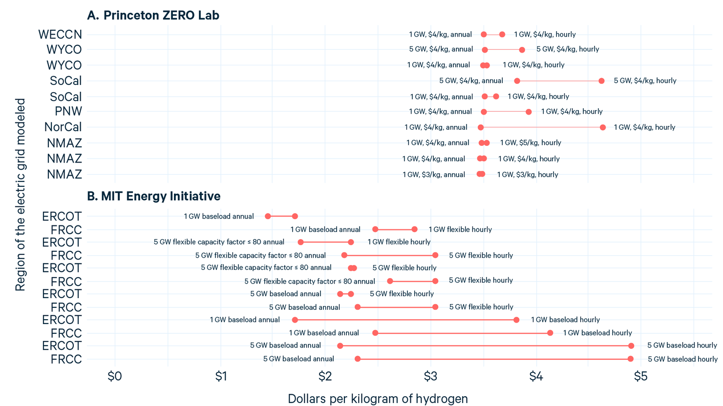
Notes: Chart shows emissions per kilogram of hydrogen in paired hourly-matching and annual-matching scenarios. In the Princeton ZERO Lab scenarios (A), the lines show a range, and the labels near each dot indicate the size of the electrolyzer in gigawatts, the assumed price of hydrogen per kilogram, and hourly or annual matching. In the MIT Energy Initiative scenarios (B), the labels indicate the size of the electrolyzer demand in gigawatts; whether the electrolyzer can be run “flexibly” (using aboveground hydrogen storage); hourly or annual matching; and the capacity factor (CF). “FRCC” is the Florida Reliability Coordinating Council. “ERCOT” is the Electric Reliability Council of Texas. “WeccN” is a grid that spans multiple western US States. “WYCO” is a zone of the electric grid in Wyoming and Colorado, “SoCal” in Southern California, “PNW” in the Pacific Northwest, “NorCal” in Northern California, and “NMAZ” in New Mexico and Arizona.
Figure 5 shows the costs from Princeton study, assuming electrolyzer capital costs of $1,200 per kilowatt, which closely matches the costs in the MITEI scenarios. Note that MITEI and the Princeton ZERO Lab calculate LCOHs in a slightly different way: Princeton includes the cost of procuring EACs in the LCOH, whereas MITEI instead includes the capital cost of the clean energy that an electrolyzer procures.
The main drivers of the cost differences for hydrogen between the hourly-matching and annual-matching scenarios are the cost of the clean energy (either procured directly or purchased in the form of EACs) and the capacity factor of the electrolyzer. (A lower capacity factor means that the electrolyzer produces less hydrogen, so that the LCOH must be higher to recover capital and fixed costs.)
In the Princeton study, the highest EAC prices occur in the four scenarios with the highest LCOHs. High EAC prices can lead an electrolyzer to ramp down production when it cannot pay the high price to procure the clean energy, which compounds the impact on the LCOH. The capacity factors generally are close to 100 percent, except in a few scenarios, the smallest of which is the 70 percent capacity factor for the electrolyzer in Northern California.
In the MITEI study, the highest costs are in the baseload scenarios, which show significant overbuild of renewables to maintain a capacity factor of 100 percent. Cost differences are mitigated in the flexible scenarios, where the flexible operation allows electrolyzers to procure less clean electricity and use aboveground storage to maintain a steady flow of hydrogen to consumers, which in turn reduces the need to overbuild renewables.
6. Conclusions
The Princeton and MITEI studies illustrate how the supply of clean electricity impacts emissions and costs, but both studies fix the amount of electrolysis that is deployed, as opposed to letting the economics determine that amount. The level of deployment can affect the costs and emissions, and the costs can affect the level of deployment. In other words, these studies aren’t giving us a complete story.
In my next issue brief for this series, I will dig into a study by Evolved Energy Research that gets at these questions, even as there are more subtle differences in how the policies are modeled.
Special Series: Implementing the Clean Hydrogen Tax Credit
This issue brief is part of a series on the so-called “45V” tax credit for clean hydrogen production in the Inflation Reduction Act. The US Department of the Treasury is expected to make decisions soon about how to implement the tax credit. In the runup to these decisions, Resources for the Future Fellow Aaron Bergman reviews the research to date on the potential implementation of the credit. Read the blog post in Common Resources that introduces the series, as well as the third installment: